How Monitor Text Clarity Works: Density Beats Resolution
Two monitors with the same resolution can draw text very differently. Here’s how pixel density, operating-system scaling and the layout of the tiny red, green and blue elements inside each pixel decide whether letters look crisp, soft or rimmed with color.
Sources
Bjango, Microsoft (ClearType), Microsoft (display scaling), PC Monitors, TFTCentral, Heise, Apple and more listed at the end.
What You’ll Understand
- Why pixels per inch matters more than the resolution on the box
- How Windows and macOS size text, and what happens in between
- What display scaling does to a Mac’s picture
- The subpixel trick Windows uses and macOS dropped
- Why some OLED monitors show colored edges on text, and what fixes it
A 27-inch 4K monitor and a 27-inch 5K monitor both count as high resolution, yet on the same Mac the 4K screen’s text can look a touch soft beside the 5K one. Neither screen is faulty. Text clarity comes from three things working together: how tightly the pixels are packed, how the operating system sizes its interface onto them, and how the colored elements inside each pixel are arranged.
Pixels Per Inch, Not Pixel Count
Resolution only counts pixels. What your eye sees is pixel density, measured in pixels per inch (PPI): the same 3,840 × 2,160 grid makes about 163 PPI on a 27-inch screen but about 140 PPI on a 32-inch one, because the larger panel spreads the pixels further apart. Apple’s 27-inch Studio Display packs 5,120 × 2,880 pixels into the same 27 inches, which works out to 218 PPI.
Density matters for text because letters are curves and diagonals drawn on a square grid. Microsoft’s description of traditional font rendering is that each pixel is simply on or off, so letter stems come out with hard “stair-steps”. Smaller pixels make each step smaller, which is why a dense screen needs less smoothing trickery to look clean, and why the same font looks blockier on a low-density panel.
| 27-inch, 2,560 × 1,440: about 109 PPI | Matches macOS’s standard (1x) design target; no scaling, but more pixelated |
| 32-inch, 3,840 × 2,160 (4K): about 140 PPI | Between the targets; needs display scaling for text at a comfortable size |
| 27-inch, 3,840 × 2,160 (4K): about 163 PPI | Between the targets; needs display scaling for text at a comfortable size |
| 27-inch, 5,120 × 2,880 (5K): 218 PPI | Matches macOS’s Retina (2x) design target; no scaling needed |
The Operating System Decides How Big Everything Is
Software is drawn for a particular density. Windows was built around 96 PPI, the density most monitors had in the past, and treats that as 100%; doubling to 192 PPI gives a “2x” interface at the same physical size. On a screen between those points, Windows applies a scale factor, and programs written to handle it redraw themselves at the new size. Microsoft’s own developer guidance is candid about the catch: a program that doesn’t support scaling is drawn at 96 PPI and then stretched by Windows, which makes it look blurry. Apps built for scaling stay crisp; many older desktop programs don’t.
macOS works differently. Its interface is designed for about 110 PPI on standard screens and about 218-220 PPI on Retina screens, according to Marc Edwards, the founder and designer of the Mac software studio Bjango, in his two guides to Mac external displays. At a density near one of those targets, the Mac maps its interface onto the panel pixel for pixel. Further away, text and controls come out too big or too small, and the fix is display scaling.
What Scaling Does to a Mac’s Picture
When you pick “larger text” or “more space” in a Mac’s display settings, macOS draws the whole screen onto an invisible canvas of a different size, then resizes that finished image to fit the panel. Edwards lists the costs: a blurrier picture, thin lines that shimmer as you scroll, moiré patterns in fine detail, more work for the graphics chip and shorter laptop battery life. In one of his examples, a divider two Retina pixels thick, shown at a 72% scale, no longer lines up with the panel’s pixels and visibly shimmers as the list beneath it scrolls.
That is the 27-inch 4K problem on a Mac. At about 163 PPI it sits between the two design targets, so getting text to a comfortable size means scaling, and scaling means a resized picture. Not everyone notices it, Edwards concedes, but it shows up in a direct comparison: in his simulation of a Studio Display next to a 27-inch 4K screen scaled to the same text size, the 4K side was the blurrier one.
At native size, a one-pixel line maps onto one column of screen pixels. After fractional scaling it can land across a pixel boundary and get spread over two columns of lighter pixels, which reads as softness, and the spread changes as the content moves.
The Subpixel Trick, and Why the Mac Dropped It
Look closely at an ordinary LCD pixel and it is three vertical stripes, one red, one green and one blue, which the eye blends into a single color. Microsoft’s ClearType uses that structure: instead of shading whole pixels at a letter’s edge, it sets the brightness of individual stripes, placing edges at a fraction of a pixel. Microsoft says this theoretically raises horizontal resolution by 300 percent. The payoff is letters whose curves look smooth without the blur that ordinary whole-pixel smoothing adds to their edges.
The trick depends on knowing the exact stripe order of the panel, and the Mac stopped using it. With macOS Mojave in 2018, Apple stopped using subpixel antialiasing. A former macOS engineer, in a Hacker News comment reproduced on Stanislas Lange’s blog, called it “obnoxious to implement”: it needs each screen’s pixel geometry passed through several graphics layers, and the text and background colors known at drawing time, which sits badly with graphics-card compositing. Lange himself found text on his 1080p monitor blurry after the update. Michael Tsai, a Mac developer who blogged the change, wrote that it “seems like a good engineering trade-off” because “the future is Retina”. The practical result is that on a standard-density monitor, Mac text gets no subpixel help, so density has to do the work; Apple’s own Studio Display sits at 218 PPI.
OLED Monitors and Colored Fringes
OLED monitors add a different problem. Samsung Display’s QD-OLED panels have red, green and blue elements, but until recently they were typically arranged in a triangle, with green sitting above red and blue, rather than in side-by-side stripes. Windows’ ClearType assumes the standard stripe, so on high-contrast edges these panels can show a thin colored fringe. PC Monitors, which examined the effect closely, describes the fringe as about a pixel wide and easy for some people to ignore at a normal viewing distance, and found that turning ClearType off does not remove it, since some of the fringing has nothing to do with how text is rendered. LG Display’s WOLED panels, which add a fourth, white subpixel, show fringing of their own; in PC Monitors’ testing some of it was more noticeable than on QD-OLED, though the site calls the comparison situational and subjective.
Density hides most of it. On 4K QD-OLED panels, about 140 PPI at 32 inches and about 166 PPI on the 26.5-inch panels sold as 27-inch, the fringe is thin enough that it shouldn’t bother the vast majority of people, even with the triangular layout. It matters most on low-density panels near 110 PPI, such as 34-inch ultrawides. Layout can matter as much as density, though: PC Monitors found the fringing on a 34-inch stripe-layout panel at about 110 PPI generally less noticeable than on a 32-inch triangular panel at about 140 PPI. Both panel makers are now moving to conventional side-by-side stripes: Samsung Display’s “V-Stripe” arrived first on 34-inch ultrawide QD-OLED panels, and LG Display has 4K WOLED panels at 27 and 32 inches with a plain RGB stripe and no white subpixel.
What This Means When You’re Buying
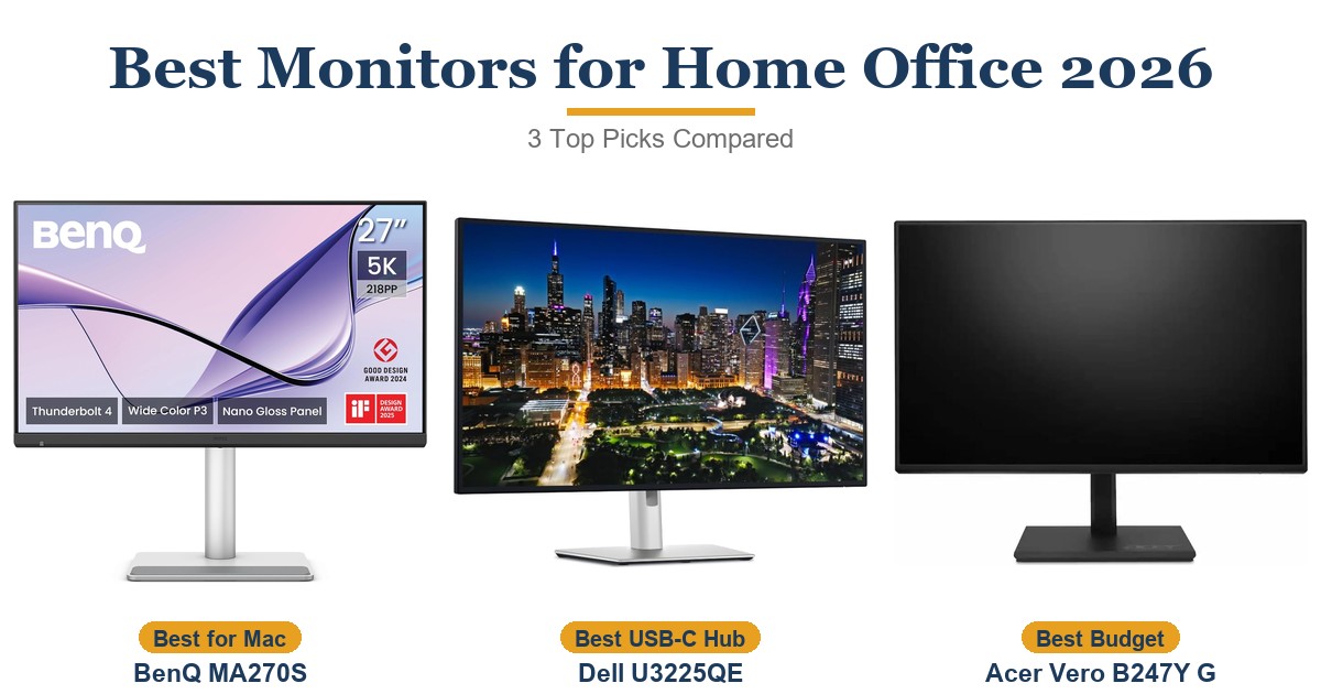
Work out the density first; the arithmetic is the diagonal pixel count divided by the screen size in inches. On a Mac, the cleanest text comes from a screen near 218 PPI, which in practice means a 27-inch 5K panel. A 27-inch 1440p screen near 110 PPI runs without scaling for less money but looks more pixelated, and a 4K screen at 27 or 32 inches sits in between and relies on scaling. Windows is more forgiving of in-between densities, because programs built for scaling redraw at the new size rather than being resized as a picture, though some older programs may still look blurry. For a text-heavy OLED, favor 4K densities or one of the new stripe-layout panels over a triangular layout near 110 PPI. The guides below apply this to current models.

As an Amazon Associate I earn from qualifying purchases. Disclosure
Not the focus of this piece, but if you’re shopping: search 27-inch 5K monitors on Amazon →search 27-inch 5K monitors on Amazon.ca →
Sources
- Bjango — Mac External Displays for Designers and Developers (2016)
- Bjango — Mac External Displays for Designers and Developers, Part 2 (2022)
- Apple — Studio Display Technical Specifications
- Microsoft — Microsoft ClearType Overview
- Microsoft — High DPI Desktop Application Development on Windows
- Michael Tsai — macOS 10.14 Mojave Removes Subpixel Anti-aliasing
- Stanislas Lange — How to Fix the Font Rendering on macOS 10.14 Mojave
- PC Monitors — QD-OLED and WOLED Fringing Issues
- TFTCentral — OLED RGB-Stripe Panels Explained: Should You Wait?
- Heise — OLED With True RGB: LG and Samsung Make Monitors More Windows-Friendly